4th and Ocean Project: Kids' and Guest Bedrooms Reveal
- Lindsey Borchard
- Feb 3, 2023
- 3 min read
It's always fun to get to go a little wild with secondary spaces, and these bedrooms are a great example. The guest room is a bit of a departure from the rest of the house with its wallpapered walls and saturated color -- it feels like a warm hug! And the bedrooms for our client's two boys were definitely within my wheelhouse as a mom of two boys. With kids rooms, we always want to strike that balance of doing something they are excited about right now with elements that they can grow up with, and I think we really nailed with with these spaces.
In case you missed it: Living & Dining Rooms, Kitchen & Family Room, Primary Suite, Basement & Laundry

Photography by Amy Bartlam
The Guest Suite
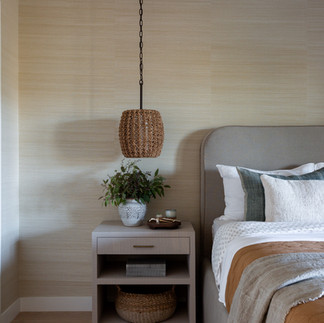
The ultimate retreat space for any guest. The California landscape was our inspiration with soft, warm colors reminiscent of the sand and mountains and the blue of the ocean. It's the ultimate calming color palette! We added texture to the room with grass cloth wallpaper, a heavily patterned rug, and the hanging pendants.


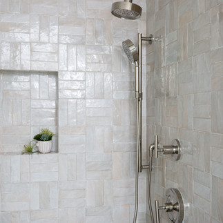
The palette continues in the adjacent bath with a pretty shade of blue on the vanity and sand-colored tile. The floor is a marble penny tile with lots of variation in color and we laid the rectangular tile in a basketweave pattern for more texture. It's a small space, but well-appointed and really complements the bedroom.

The "Sports" Bedroom
The older boy requested a sports-themed room, which we delivered in a subtle -- but still effective -- way. The first thing you notice when walking in is the wall-to-wall built-in bed. It has a shallow shelf for displaying art or trophies and it will be really easy to add or take away from this collection has he grows (a key to designing kids' rooms, in my opinion). We really played with pattern in here with a small stripe on the bed, a larger pattern on the rug, and another pattern on the window shades. The oversized light over the bed is a fun, modern element that's unexpected.
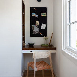
Across from the bed is a small built-in desk with inset floating shelves for trinkets, trophies, and all the little things that boys collect (ask me how I know!). The wood tones in here are little darker, which feels more masculine and grown-up than his younger brother's space.


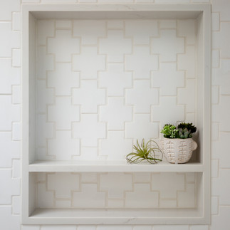
The vibe for his bathroom is upscale mens locker room . We used three colors of penny tile on the floor to create a striped pattern, and then carried only the grey into the shower floor. The shower walls have tile in a Swiss cross shade with white grout and the black plumbing pieces really pop against it. We kept the vanity simple in a light grey and then added black and light wood details with hardware, mirror, and hooks to finish off the space.

The "Space" Bedroom
The younger son loves all things outer space, but again, we wanted the main design elements of the room to be flexible enough to stay around as his interests evolve. The star wallpaper on the ceiling is a nod to space without being too overt and the pattern is busy enough to not be overpowering. We played with blues, greens, blacks, and whites for his color palette and the custom bed upholstered in a green linen one of my favorite pieces. Art that depicts the phases of the moon and a ceiling light in the shape of a star further incorporate the theme. Floating shelves above the desk and a set of shelves for books can be updated and changed as he grows.


We actually designed the bathroom first after finding this super-cool black cement floor tile. We had it laid so that the stars depict a constellation that is often over his bedroom! The vanity is designed for optimal storage and easy access to his things with integrated hardware and a leathered cement-looking counter top that has a slightly industrial feel and will be easy to keep up. The tub shower combo has a white matte tile that reminded us of the color of the moon, and we carried the tile behind the toilet for easy cleaning (again, ask me how I know!).
Creating spaces that reflect our clients is our passion. If you'd like to find out how we can help with your own project, please get in touch by filling out our design inquiry, and a member of our team will be in touch.












Lindsey, I’m absolutely inspired by the way you brought personality and functionality into every corner of the 4th and Ocean project! The balance you struck between playful themes and timeless design in the boys’ rooms is genius—I especially love the star wallpapered ceiling and constellation floor tile. The guest suite’s warm, textured palette feels like an instant escape. Your thoughtful layering of patterns and textures gives each space its own soul. As I plan updates to my own home, I’m considering a round house number plaque to complement the design—and I found the perfect one to buy on Bsign Store!
Get unlimited downloads with IDM Crack – safe & working! 🔥